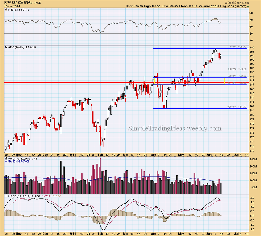
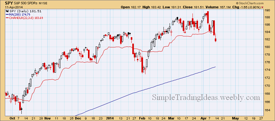
The daily chart below shows SPY, the SPDR S&P 500 ETF representing the Large-Caps. SPY was overbought recently as you can see in the indicator window above the chart and it's not a surprise if SPY moves lower or sideways in the short-term. MACD also looks like ready to cross below the signal line. For the next support level we can use Fibonacci retracement levels, most likely the 50-62% levels and the 187.60 level (red line). SPY crossed this level several times during the past couple of months.
0 Comments
The Chaikin Oscillator measures the momentum of the Accumulation Distribution Line. The calculation is similar to the calculation of MACD but instead of the price it uses the Accumulation Distribution Line. It is an indicator of an indicator. The Chaikin Oscillator is the difference of the 3-period EMA and the 10-period EMA of the Accumulation Distribution Line. Similar to other momentum indicators, it is designed to anticipate directional change in the trend as momentum change usually precedes trend change. The calculation uses both the price and volume since it is based on the Accumulation Distribution Line. The Chaikin Oscillator gives buy/sell signals by bullish/bearish divergences and centerline crossovers. The chart below shows the weekly chart for SPY, the S&P 500 ETF with the Chaikin Oscillator in the indicator window (the chart also shows the 20-period Price Channels). There was a noticeable bearish divergence since last year Novermber and the Chaikin Oscillator finally crossed below zero at the end of March. That is considered a sell signal according the Chaikin Oscillator. The Accumulation Distribution Line is falling and selling pressure dominates.
The monthly chart below shows SPY, the S&P 500 ETF with two indicators, RSI above the chart and PPO below the chart. RSI is overbought and there is a slight divergence, it has been moving lower while SPY was moving higher. PPO(1,120) tells us the price difference in percentage between the 1- period EMA and the 120-period EMA (10 years). The 1-month EMA is 53.698% higher than the 120-month EMA. PPO(1,120) has reached extreme levels, higher than back in 2007. Also notice that there is a slight divergence here too, PPO(1,120) failed to reach new highs.
A couple of things I want to briefly note about the weekly chart. RSI was overbought and has been moving lower since the beginning of this year even though SPY had higher highs. MACD is still below the signal line and the signal line is moving lower. ATR has been moving higher since the beginning of the year even though SPY has basically stalled.
The Chandelier Exit can be used to set your trailing stop-loss during an uptrend or during a downtrend. You can read more about the Chandelier Exit here. Normally during an uptrend the Chandelier Exit is placed 3 ATR (Average True Range) below the 22-period high and during a downtrend it is placed 3 ATR above the 22-period low. The Chandelier Exit changes with new highs or lows and changes in volatility (ATR). It can prevent the trader from an early exit of a long or short position. During an uptrend a break below the Chandelier Exit can signal weakness or the end of an uptrend. The daily chart below shows SPY, the S&P 500 ETF with the Chandelier Exit. Currently it closed below the Chandelier Exit.
The hourly chart below shows SPY, the S&P 500 ETF with ATR (Average True Range) in the indicator window. ATR is a volatility indicator calculated from the True Range which uses absolute price changes. ATR is not a directional indicator it reflects the degree of interest or disinterest in a price move. Strong moves in either direction are often accompanied with large True Ranges. An increase in ATR can show strong buying or selling pressure. As you can see on the chart below Friday’s sharp decline took place with increased ATR on the hourly chart.
The Vortex Indicator is a unique directional indicator. The Vortex Indicator shows volatility-adjusted posotive trend movement and volatility-adjasted negative trend movement. The indicator oscillates above/below 1. During an uptren +VI is above -VI and during a downtrend -VI is above +VI. During a consolidation +VI and -VI moves in a narrow range. As you can see on the daily chart below that's what happening for SPY, and we are waiting to find out which Vortex Indicator is going to move higher.
Below you can see the 60 minute chart for SPY with the 14 period RSI below the chart. Within the last two days of last week RSI moved above 70 and became overbought. Notice that the last candle shows incresed selling pressure at the end of the trading day.
$NYMO, the NYSE McClellan oscillator turned negative in November and stayed negative for the most part. It turned positive twice since then but stayed below 50 even though $NYA moved higher. Since the McClellan oscillator is a breadth indicator calculated from net advances, staying below zero means that declining issues outnumber advancing issues.
The chart below shows the 50-day and 200-day moving averages for $CPCE, the CBOE Equity Put/Call Ratio. There is also the 200-day Bollinger Band with the 0.6 standard deviation bands. The S&P 500 index, $SPX is in the background for refernce. The chart starts in 2004. As you can see the 50-day moving average pretty much stays in the 0.6 standard deviation Bollinger Bands around the 200-day moving average. Notice how the 200-day moving average is moving lower and lower soon reaching low levels only mached in 2006 and 2011 on the chart. Also notice that the 50-day moving average is touching the lower Bollinger Band. In the past touching the lower band was followed by a sharp move higher.
|
Loading
Search Site
Links
Archives
September 2014
Categories
All
|